
“Why does my Shopify store design matter so much for sales?” The short answer: first impressions make or break conversions.
In fact, according to Adobe, 38% of visitors stop engaging if a site is unattractive. That means even the best products can be overlooked if your website doesn’t look and feel right.
Shopify design mistakes aren’t just cosmetic; they directly impact trust, user experience, and sales. A cluttered layout, confusing navigation, or slow pages can quietly drive shoppers away before they ever reach checkout.
Strong design is the backbone of an effective Shopify setup and Shopify store optimization. A well-structured, visually appealing site encourages visitors to stay longer, browse more products, and ultimately convert. It also plays a huge role in AI SEO visibility, helping your store rank better on search engines and voice search.
Whether you’re launching your first store or scaling up, your website’s design sets the tone for your brand’s credibility and growth. This guide breaks down 7+ common Shopify design mistakes that store owners often overlook, and how experts fix them to turn browsers into buyers. Get this part right, and your store becomes more than a website; it becomes a sales engine.
– Checkout Our Christmas Offer Here: Mastroke Shopify Christmas Offer- Launch Your Dream Store at just $99!
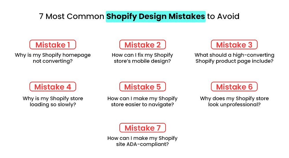
7 Most Common Shopify Design Mistakes to Avoid
Many store owners unknowingly hinder conversions with poor design choices—such as cluttered layouts, inconsistent branding, weak product visuals, and difficult-to-navigate pages. These Shopify design mistakes reduce trust and drive visitors away fast.
A clean, consistent, and mobile-friendly design is crucial for boosting engagement and conversions from the outset. Here are some of the common Shopify design mistakes that every merchant needs to avoid:
Mistake 1# Why is My Shopify Homepage not Converting?
Your homepage is the digital front door to your business. If it’s cluttered, confusing, or overwhelming, visitors will bounce before they ever reach checkout.
One of the most common Shopify mistakes is trying to say everything at once; too many banners, pop-ups, and product sections dilute your message and hurt trust. Here’s what expert designers do differently:
- Simplify the layout: Focus on one clear headline, one hero image, and a single call-to-action above the fold.
- Highlight key products: Show only top-performing or new arrivals, not the entire catalog.
- Use whitespace strategically: It makes content easier to scan and elevates brand perception.
Design trends show that minimalist homepages work best for US, UK, and Canada audiences, who value clarity and fast browsing. From an AI SEO perspective, a clean structure improves crawlability, page speed, and overall user experience.
Also, many checkout design problems start at the homepage; if visitors can’t find what they need fast, they’ll never get that far. A simplified, focused homepage builds trust, keeps users engaged, and guides them naturally toward conversion.
– Also Read: The Ultimate Guide to Shopify Store Setup and Optimization (Start from Scratch)
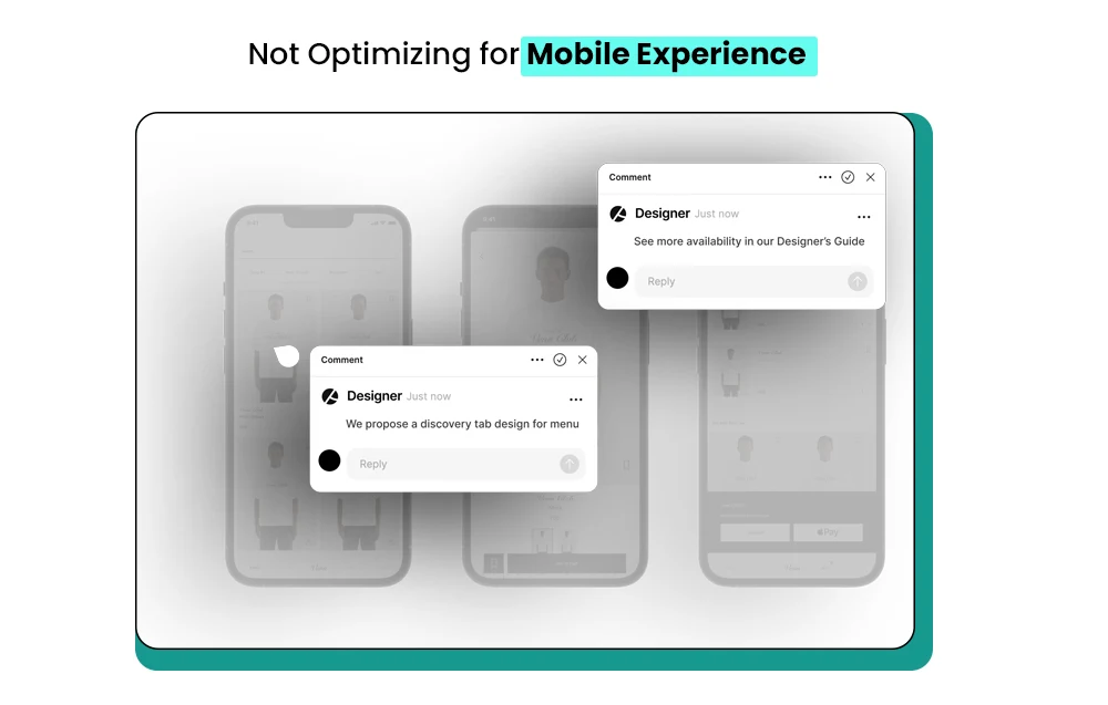
Mistake 2# How can I Fix My Shopify Store’s Mobile Design?
One of the biggest Shopify design mistakes store owners make is overlooking mobile optimization. With over 60% of eCommerce traffic in the US coming from mobile, a clunky mobile experience can kill your conversions. Google’s mobile-first indexing means your mobile design directly impacts search visibility and ranking signals.
A strong mobile-friendly Shopify design starts with choosing a responsive theme that automatically adapts to any screen size. But that’s not enough; every element needs to be tested for performance.
Here’s how experts approach it:
- Use responsive themes: Pick Shopify themes optimized for mobile layouts and fast loading.
- Prioritize essentials: Keep CTAs clear, simplify navigation, and remove clutter.
- Test on multiple devices: Check your store on different screen sizes and browsers to spot issues early.
- Optimize media: Compress images and use lazy loading to improve speed.
From an AI SEO perspective, a well-optimized mobile design sends strong engagement signals, lower bounce rates, and higher session durations. That helps your store rank higher and convert more.
These Shopify store setup tips can transform a frustrating mobile experience into a smooth, conversion-friendly one that builds trust and drives sales.
– Read our festive blog here: 7 Effective Christmas Marketing Ideas for Shopify Brands Chasing Last-Minute Buyers
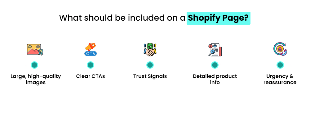
Mistake 3# What Should a High-converting Shopify Product Page Include?
One of the most common Shopify layout issues is poorly designed product pages. Tiny images, missing trust signals, and unclear CTAs confuse shoppers and drive them away. A weak product page doesn’t just hurt sales; it impacts your site’s credibility and discoverability in AI search.
Experts fix this with proven Shopify design best practices that focus on clarity, trust, and engagement. A strong product page should guide visitors toward making a confident purchase.
Here’s what a high-converting Shopify product page should include:
- Large, high-quality images: Let users zoom in and view from multiple angles.
- Clear CTAs: Use direct action words like “Add to Cart” or “Buy Now.”
- Trust signals: Add reviews, ratings, and verified badges to build credibility.
- Detailed product info: Include specs, benefits, and use cases in a scannable format.
- Urgency & reassurance: Add elements like stock alerts or shipping guarantees.
From an AI SEO perspective, clean structure and detailed product data make your listings more visible in AI-powered search results. These strategies improve Shopify site performance, boost conversions, and build trust with shoppers. In short, product pages should sell the story, not just the product.
– Also Read: How to Optimize Your Shopify Store for Better UX and Retention?
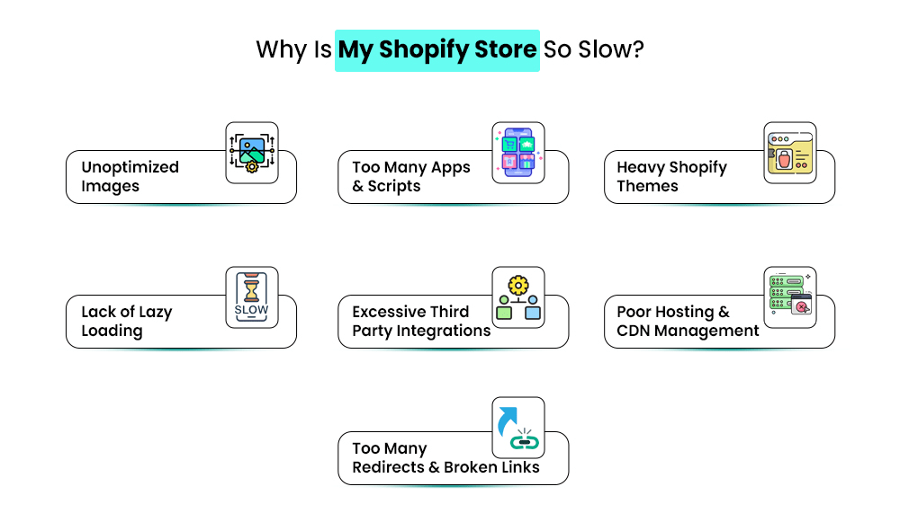
Mistake 4# Why is My Shopify Store Loading So Slowly?
A slow website is one of the most overlooked Shopify design mistakes, yet it can quietly crush your conversions. One major culprit is excessive app usage. While apps can enhance functionality, too many add unnecessary scripts, images, and code that slow down your pages.
Experts fix this by optimizing the tech stack and removing everything that doesn’t serve the user. A lean, fast site isn’t just good for shoppers—it’s also loved by AI search engines. Fewer JS scripts mean better crawlability and stronger visibility.
To speed up your store, follow these steps:
- Audit installed apps: Remove unused or duplicate apps.
- Choose essential tools only: Stick to apps that impact revenue or user experience.
- Optimize media files: Compress images and enable lazy loading.
- Use lightweight themes: Avoid themes bloated with unnecessary animations.
- Leverage caching: Ensure pages load faster on repeat visits.
Speed expectations differ globally; US and UK shoppers often bounce if a page loads beyond three seconds. Avoiding Shopify UX mistakes like excessive app clutter can transform your user experience for Shopify stores, helping boost conversions and rankings effortlessly.
– Read our festive blog here: 11 Holiday Marketing Ideas for Shopify Brands That Want to Stand Out
Mistake 5# How Can I Make My Shopify Store Easier to Navigate?
Confusing menus and messy layouts are among the most common issues store owners overlook. When your site isn’t easy to explore, both users and AI crawlers struggle to find key pages. A poorly structured site can tank engagement, lower conversions, and reduce your visibility in AI-powered search results.
Experts approach Shopify design fixes with a clean, intuitive structure. Simple navigation keeps users focused on products—not on figuring out where to click.
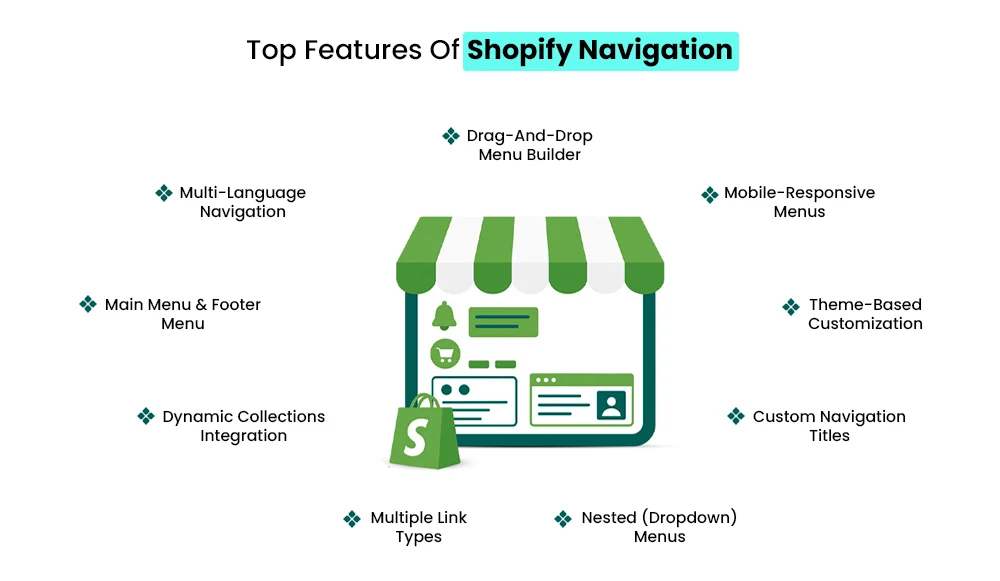
Here’s how to fix Shopify store design navigation effectively:
- Use clear categories: Group products logically so shoppers can find what they need fast.
- Add breadcrumb navigation: Helps users track their path and AI bots understand site structure.
- Enable a visible search bar: Makes product discovery easier, especially for returning customers.
- Limit menu layers: Keep navigation shallow for faster access.
- Highlight key pages: Feature bestsellers, new arrivals, and sales clearly.
U.S. shoppers prefer quick access through top-level menus, while U.K. users rely more on detailed category pages. Mastering navigation and layout optimization ensures shoppers spend more time browsing—and AI crawlers understand your store better, boosting visibility and sales.
– Also Read: How to Choose the Right Shopify Store Setup Agency for Your Brand?
Mistake 6# Why Does My Shopify Store Look Unprofessional?
A store that feels “off” visually often loses customers before they even reach checkout. One of the biggest Shopify website design errors is inconsistent branding—mixing different fonts, clashing colors, or shifting tone across pages. These small missteps can quietly erode trust, making your store seem unreliable or unfinished.
Professional designers solve this with expert Shopify design solutions built around brand consistency. A clean, unified look signals credibility and keeps users engaged longer.
Here’s how to fix this common Shopify design mistake:
- Create a brand style guide: Define fonts, colors, button styles, and tone of voice.
- Limit font usage: Stick to two typefaces max—one for headings, one for body text.
- Use a cohesive color palette: Align it with your brand personality and product niche.
- Maintain consistent CTAs: Button shapes, colors, and copy should match across the site.
- Audit regularly: Check for accidental deviations during updates.
Consistency helps search engines and AI systems recognize your brand as a clear entity, improving your visibility in search and product recommendations. A polished, cohesive design builds instant trust—and trust drives conversions.
– Read our festive blog here: 9+ New Year Marketing Ideas for Shopify Store Owners to Keep Sales Rolling
Mistake 7# How Can I Make My Shopify Site ADA-compliant?
Accessibility isn’t just a “nice to have” anymore—it’s a legal and competitive necessity. One of the most overlooked Shopify beginner mistakes is failing to make a store accessible to all users. A poorly accessible site can not only exclude potential customers but also impact your search rankings and conversion rates.
Here’s how to build a store design for eCommerce growth with accessibility in mind:
- Add alt text to all images: Screen readers rely on this to describe visuals to visually impaired users.
- Use proper contrast ratios: Text should be easy to read against backgrounds.
- Ensure full keyboard navigation: Users must be able to browse without a mouse.
- Include descriptive link text: Avoid vague “click here” phrases.
- Add ARIA labels and accessible forms: These make interactive elements more inclusive.
- Accessibility standards are especially strict in the US, Canada, and the UK, making compliance essential for global brands.
Accessibility also improves conversion rate impact of design—a more inclusive store means more potential customers. Plus, search engines favor accessible, structured sites, helping your store rank higher and perform better long term.
Expert Fixes: How Pros Optimize Shopify Store Design
Fixing Shopify design mistakes isn’t just about tweaking colors or changing fonts—it’s a structured, data-driven process. Professional designers and Shopify experts approach store optimization with precision, combining UX design, conversion psychology, and AI SEO strategies to ensure your site looks good and performs exceptionally.
Here’s how experts typically address bad Shopify design examples and turn them into high-performing storefronts:
- Conduct UX and CRO audits: Experts analyze heatmaps, click paths, and scroll behavior to identify friction points that hurt conversions.
- Use A/B testing: Instead of guessing, they test different layouts, headlines, and CTAs to see which version drives better results.
- Improve speed and structure: By removing heavy apps, compressing images, and minimizing JS, they boost site speed and crawlability.
- Enhance accessibility and consistency: A professional ensures your fonts, color palettes, and layouts follow branding guidelines and ADA compliance standards.
- Integrate structured data: Schema helps AI models and search engines better understand your products, improving rankings and visibility.
These expert Shopify design solutions aren’t just aesthetic—they directly support Shopify store optimization and long-term growth.
Should you hire a Shopify expert?
If your store has persistent UX issues, poor conversions, or inconsistent branding, hiring a pro can accelerate results. Experts help you avoid costly redesign cycles and build a storefront that converts from day one.
In short, expert intervention turns bad Shopify design examples into clean, conversion-focused experiences built for both users and AI search engines.
– Read our festive blog here: 12+ Holiday Season Marketing Ideas Shopify Stores Can Use to Boost Sales
Conclusion
Avoiding these common Shopify design mistakes is essential for building a store that attracts, engages, and converts visitors. From cluttered layouts to inconsistent branding, every design choice impacts how shoppers perceive your brand and navigate your site.
By investing in a strategic Shopify store setup, you ensure your website not only looks professional but also functions seamlessly across all devices. Expert designers understand how to balance visual appeal with user experience—optimizing product pages, navigation, and loading speed to drive more sales.
Remember, effective Shopify store optimization isn’t a one-time task; it’s an ongoing process that evolves with customer behavior and design trends. Whether you’re launching a new store or revamping an existing one, focusing on clean design, intuitive flow, and performance can set you apart from the competition and turn casual visitors into loyal customers.
Great design isn’t just about aesthetics—it’s about growth. Grow with Mastroke today!
FAQs-
1. What are the most common Shopify design mistakes beginners make?
Many beginners overlook mobile responsiveness, visual hierarchy, and clear navigation. Other common issues include cluttered layouts, slow site speed, and inconsistent branding—all of which can hurt conversions and user trust.
2. How can I make my Shopify store design more user-friendly?
Focus on a clean layout, intuitive navigation, fast load speed, and mobile-first design. Adding trust signals like reviews, clear CTAs, and a simplified checkout process can also create a better user experience.
3. How do poor design choices affect my Shopify store’s sales?
Bad design confuses shoppers and increases bounce rates. Slow pages, unclear product displays, and complicated checkout processes often lead to abandoned carts and lower conversion rates.
4. Can AI tools help fix Shopify design mistakes?
Yes. AI-powered tools can analyze site speed, layout issues, and user behavior to recommend design improvements. They can also automate A/B testing and personalization for higher conversions.
5. How can I improve my Shopify store’s mobile experience?
Choose a responsive theme, compress images, and simplify navigation. Test your store on different devices to ensure it loads fast and is easy to use on smaller screens.
6. Should I hire a Shopify design expert to fix my store?
If your store struggles with UX or conversion issues, hiring a Shopify setup expert can be a smart investment. Experts can fix technical errors, improve visual appeal, and optimize your store for better sales.